
版权 ©️黄河文创网,欢迎转发,禁止以黄河文创网编辑版本进行任何形式转载

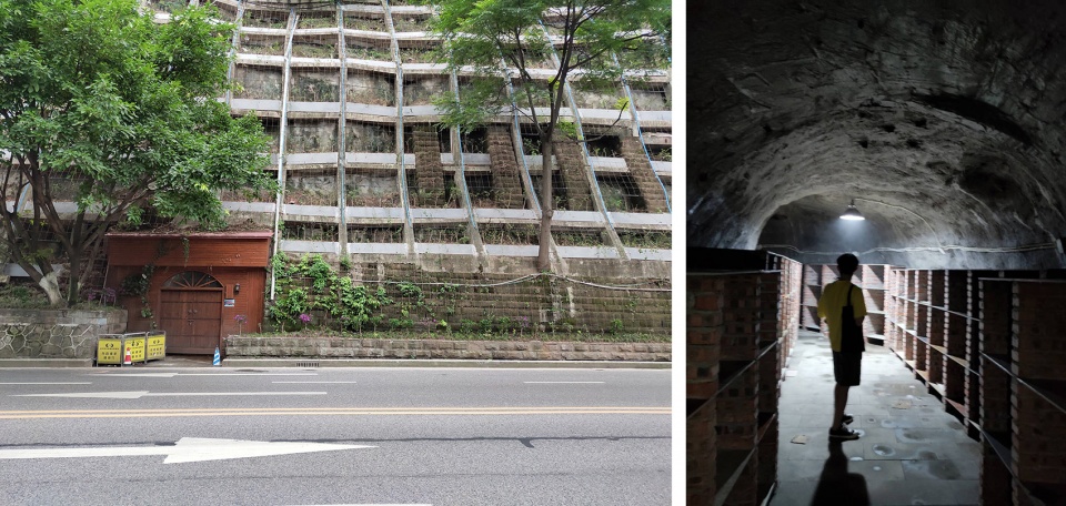
在重庆革命历史的长河中,这座城市留下了许多独一无二的东西,防空洞就是其中之一,这是一个庞大的隐秘世界。战时的重庆山多路窄,不少的防空洞都是依山而建。在这片独属雾都的地下城,环境阴冷又潮湿,黑黢黢的洞子深不见底,这是洞穴自带的“迷宫美学”。
▼夜景外观,exterior view by night©17
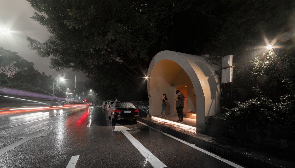
In the long history of Chongqing’s revolutionary past, the city has left behind many unique things, and one of these is the air-raid shelter, which is a vast and hidden world. The hills of wartime Chongqing were so narrow that most of the air-raid shelters were built on hills. In this unique underground city of fog, the environment is cold and damp, and this is a cave with a “labyrinthine aesthetic”, which is so dark and deep that it cannot be seen from the bottom.
▼场地原始照片,original photos©itD studio
空间概念
Concept
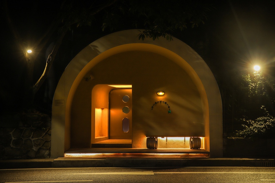
Caver源于cave这个单词,洞穴。但Caver并非指居于洞穴的穴居人,而是勇于深入洞穴的探险者。这与场地空间感相呼应,寓意着我们即将开始一场奇幻的山体空间探索。
Caver is from the word cave. But caver does not refer to the dwellers who live in the cave, it means the explorers who venture deeper into the caves. This echoes the spatiality of the site, signifying that we are going to have a fantastical exploration.
▼洞穴立面,caver facade©17
前期探索
Previous Exploration
开始设计CAVER时,我们思考如何体现防空洞的空间特质,我们最开始对防空洞进行了多种尝试及设计演练,但反复推敲后,我们决定保留空间的洞穴性。内部空间在延续防空洞特性的情况下,我们利用了原本洞穴的地面高低落差,尽量把所有管道埋藏在地下,施工过程中落差形成台阶给人带来不一样的递进探索体验。
When we started designing Caver, we supposed that how to reflect the spatial qualities of the air-raid shelter, and we initially experimented and rehearsed various designs for it. But after our consideration, we decided to retain the cavernous nature of the space. The interior space continues the character of the air-raid shelter, and we have taken advantage of the difference in the ground level of the original cavern and buried all the pipes underground as far as possible, forming steps during the construction process to give people a different progressive exploration experience.
▼设计草图,sketch©itD studio
入口空间
The entrance
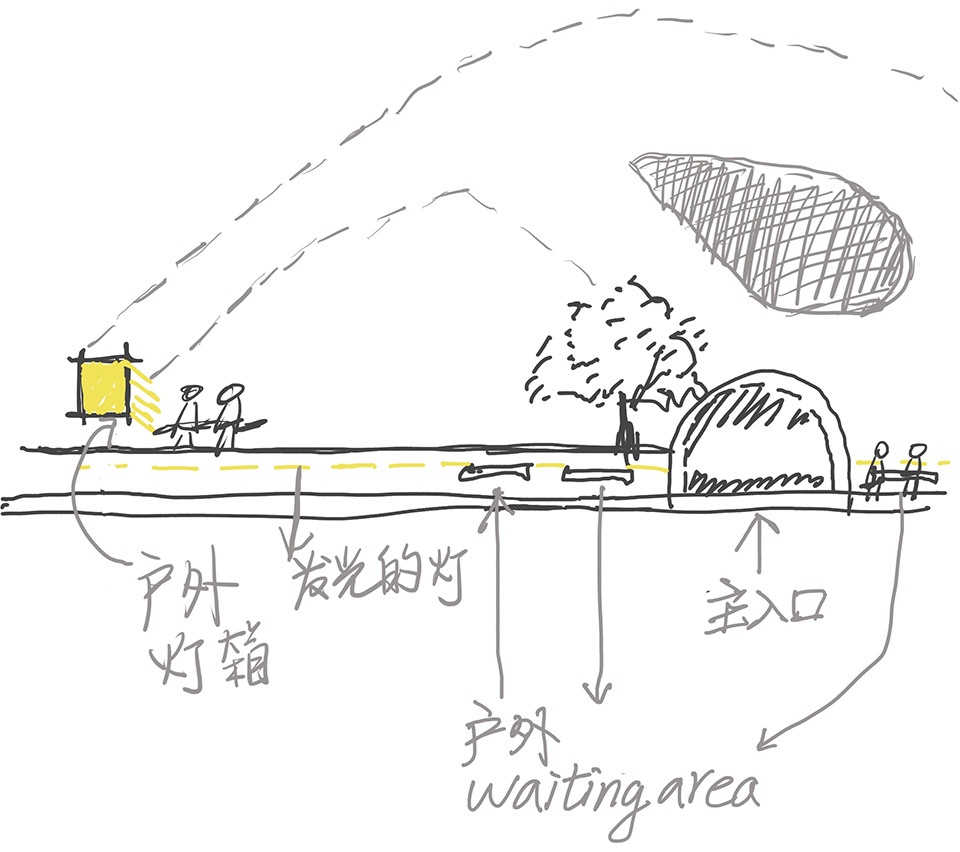
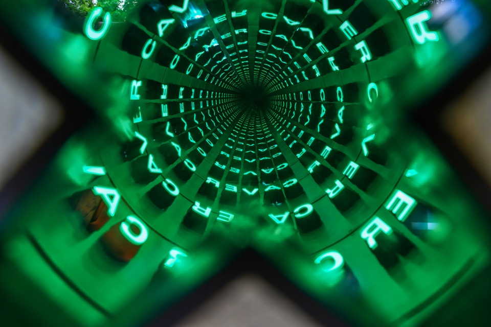
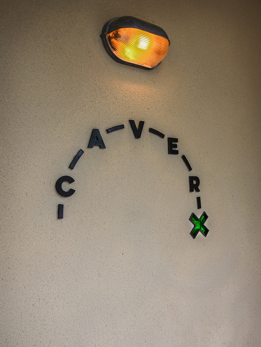
为了让门头有更多的耍法,让客人的进洞仪式感更强烈,设计上仅开一扇小门让客人进入,并在小门旁再开一扇连接内外的窗。于是我们在门头原型的基础上做了诸多变化,希望找寻到观感和比例适合的方案。在入口的CAVER旁边加了一个X,X意味着宝藏,在末尾字母X中做了一个镜面反射而造就无限循环的设计。从X中望去,就像是在一个奇幻的星球中探索。在真正进入洞穴之前是一个过渡空间,缓解从城市的喧闹环境进入寂静山体环境的跳跃感。并且,左侧入口向内伸进的距离和门头错落形成一个等待区域,因室内头顶开的天窗以及墙壁的光线都散发着神秘的吸引力。
▼设计草图,sketch©itD studio

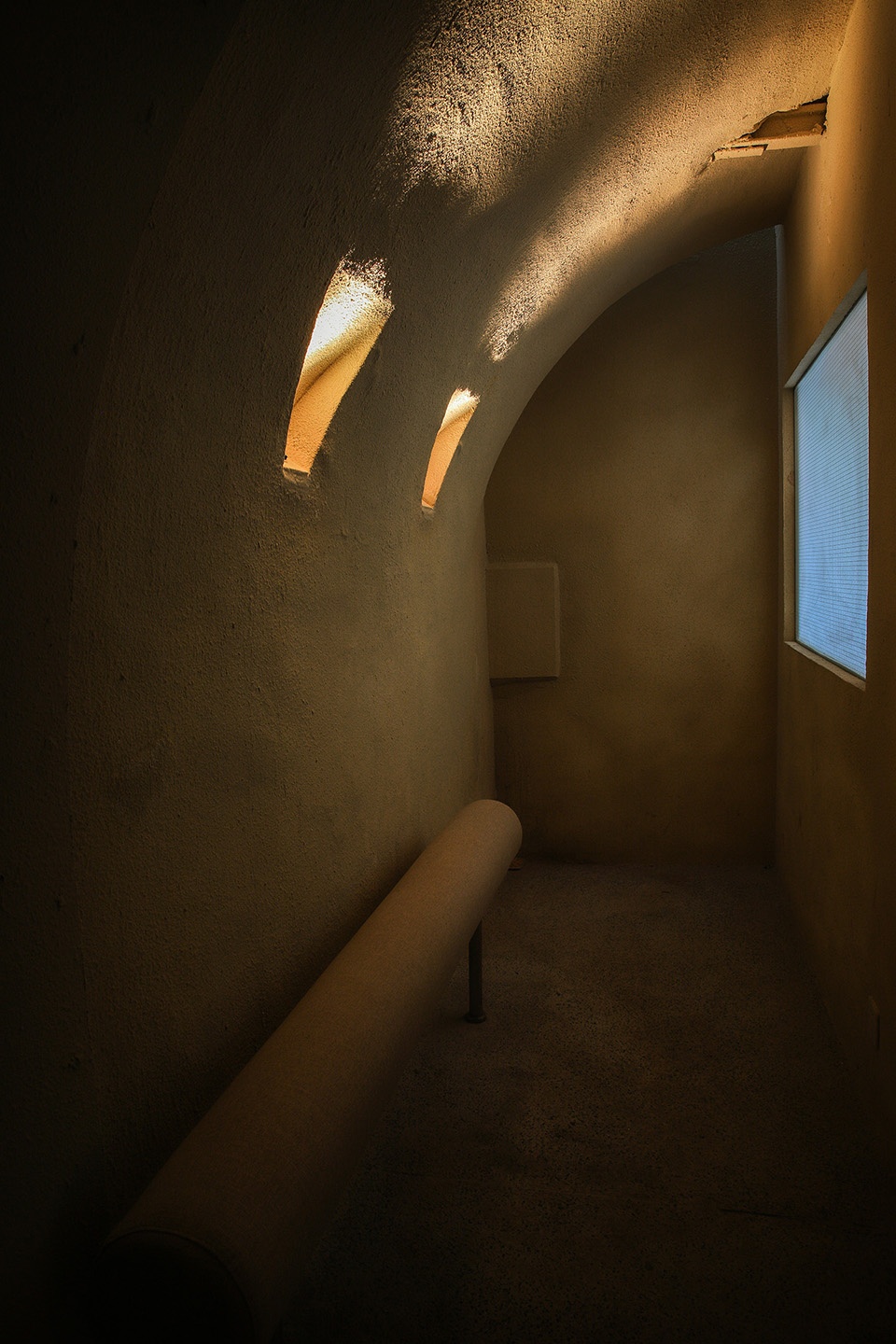
In order to make this door more interesting and give guests a stronger sense of ritual entry into the cave, it was designed to open only a small door for guests to enter, and open another window next to the small door which is connected to the inside with the outside. So we made a number of changes to this door, hoping to find a solution with an appropriate appearance and proportions.An X was added next to the CAVER at the entrance and the X means treasure. And a mirror reflection was made at the end of the letter X to create an infinite loop so that looking through the X is like exploring a fantasy planet. Before actually entering the cave, there is a transition space to ease the jump from the bustle of the city into the silence of the mountain environment. What’s more, the left-hand entrance reaches inwards for a distance and the door is staggered to form a waiting area, which makes a mysterious appeal due to the skylight opening overhead in the interior with the light from the walls.
▼入口,entrance©17
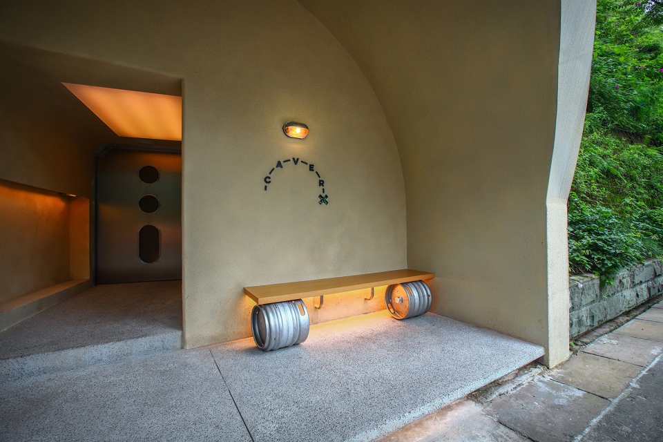
▼等候区,waiting area©17
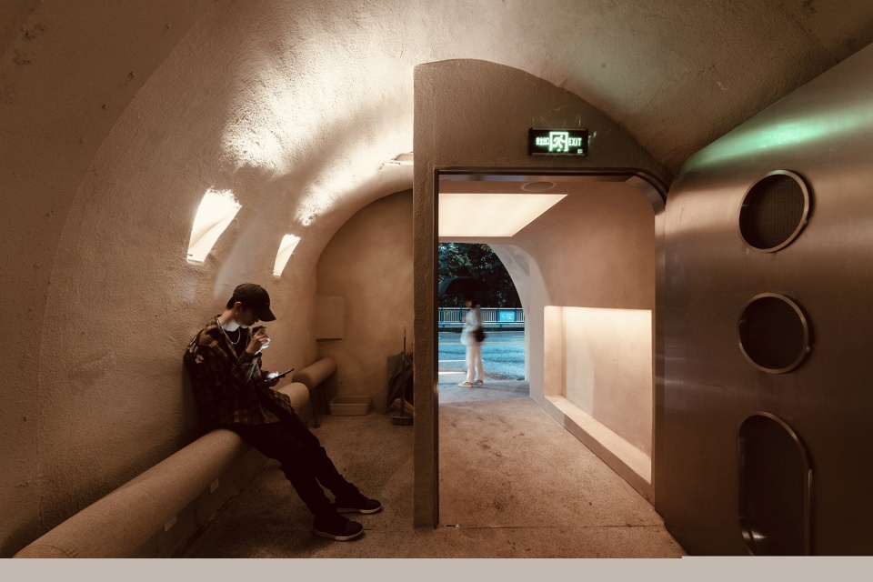
▼天窗和墙壁光线散发着神秘的吸引力©17
the clerestory and wall lightmake a mysterious appeal
室内概览
Interior view
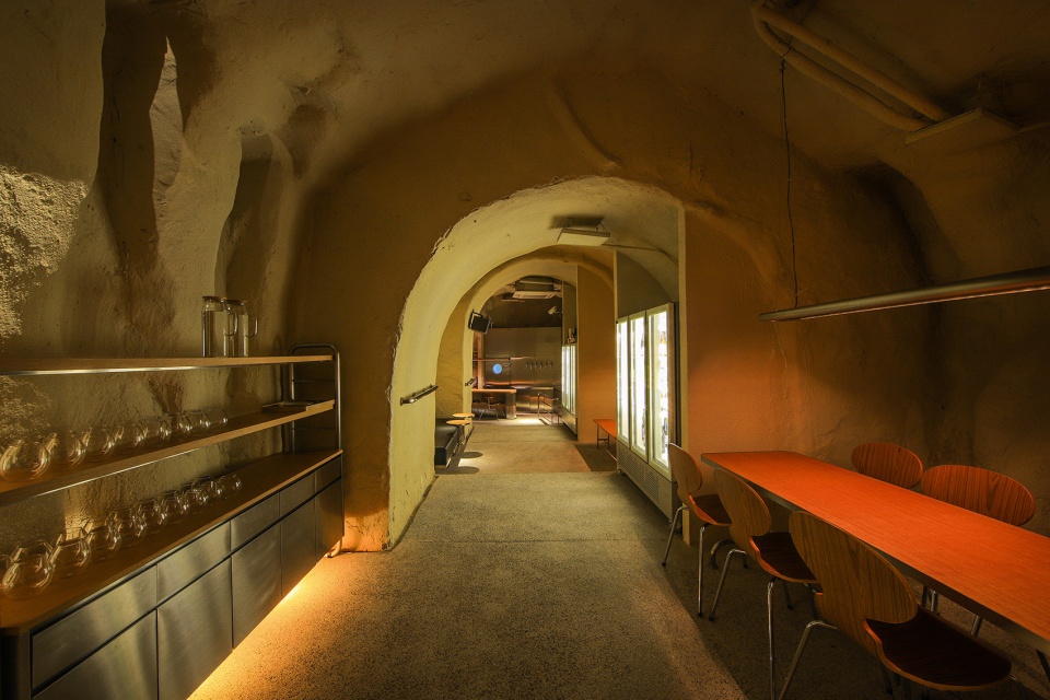
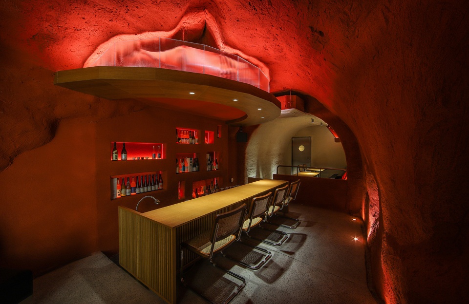
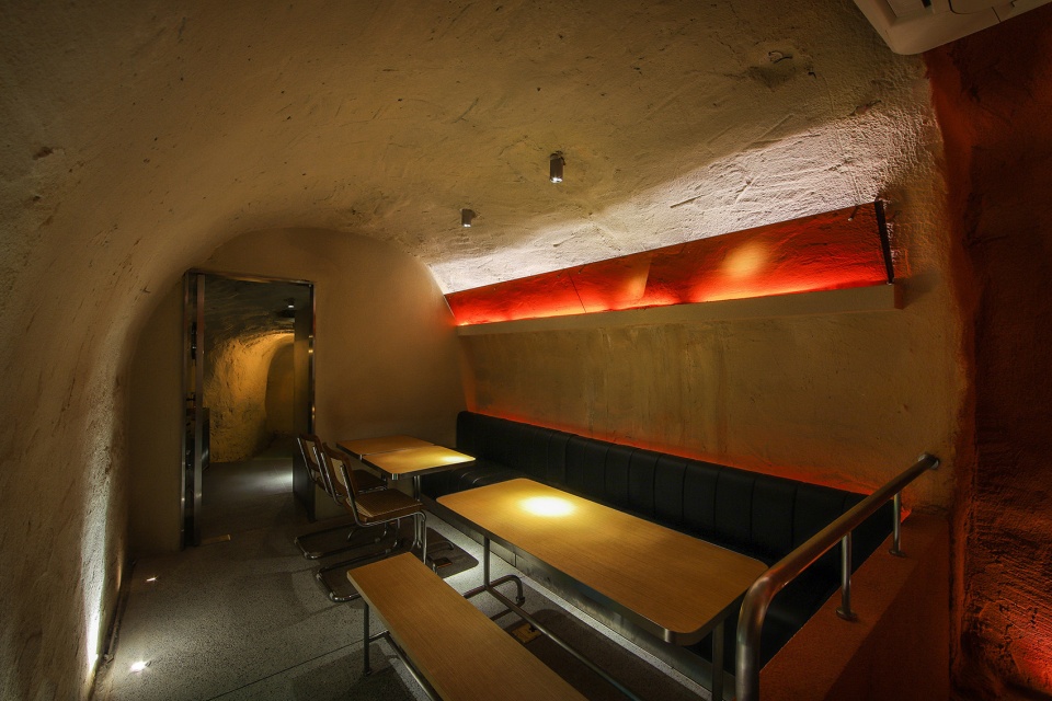
在清酒陈列区上方天花有一个弧形顶面,采用长虹玻璃,希望它的边缘性更加模糊,在保证空间丰富的同时,能更好的呈现出洞子的延续性。由于无法向山体凿洞,清酒吧酒柜的设计利用增加墙体厚度为的是保留像天然洞穴一样的感觉开了相对应的洞,形成酒柜功能,给客人带来一种陈年老酿的氛围。最后在家具设计上,采用Bauhaus家具来搭配防空洞空间,每组家具之间都有明显的划分,目的是为了缓解防空洞自身隧道的结构性,也具备了功能划分的作用。靠墙卡座都使用了软包处理,消除了洞穴冰冷的感觉。
There is a curved ceiling above the sake display area with a long iridescent glass, which hopefully has a more blurred edge, ensuring a rich space while better presenting the continuity of the cave. As it is not possible to cut a hole into the mountain, the design of the wine cabinet in the Qing Bar uses the increased thickness of the wall so as to retain a natural cave-like feel opening the corresponding hole to form a wine cabinet function and bring an atmosphere of aged wine to the guests. Finally, the furniture design uses Bauhaus furniture to match the shelter space, with clear divisions between each group of furniture, in order to alleviate the structural nature of the shelter’s own tunnels and also to serve as a functional division. The cardholders against the walls are all treated with soft cladding to eliminate the cold feeling of the cave.
▼室内概览,interior view©17
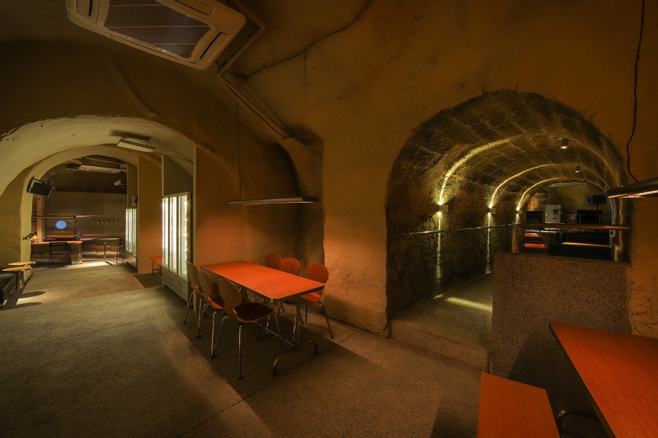
▼室内设有不同形式的座位区,the interior space with different seating areas©17
光的指引
Guide of light
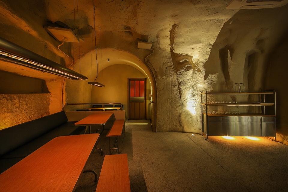
在CVAER室内的灯光为了增强空间的独特性,在室内给客人们带来的不仅仅是不一样的灯光体验,更着重于在灯光与空间的关系上,营造层层递进的感觉。而且在每一个座位上都有打下一个特殊的灯光,让人们都跟随这些灯光的指引,在视觉上,一圈又一圈的灯光包裹着一个又一个的空间,探索着一个又一个的空间,给人在视觉与感觉上都带来不一样的探索体验。
The lighting in the Caver is designed to enhance the uniqueness of the space, giving guests not only a different lighting experience but also concentrating on the relationship between the lighting and the space, creating a sense of progression in the layers. Each seat is illuminated with a special light, so that people can follow the guide of these lights, visually wrapping around one space after another, exploring one space after another, giving a different experience of exploration in both visual and sensory.
▼光的指引,guide of light©17
空间特色
Space Features
场所精神 | Spirit of Place
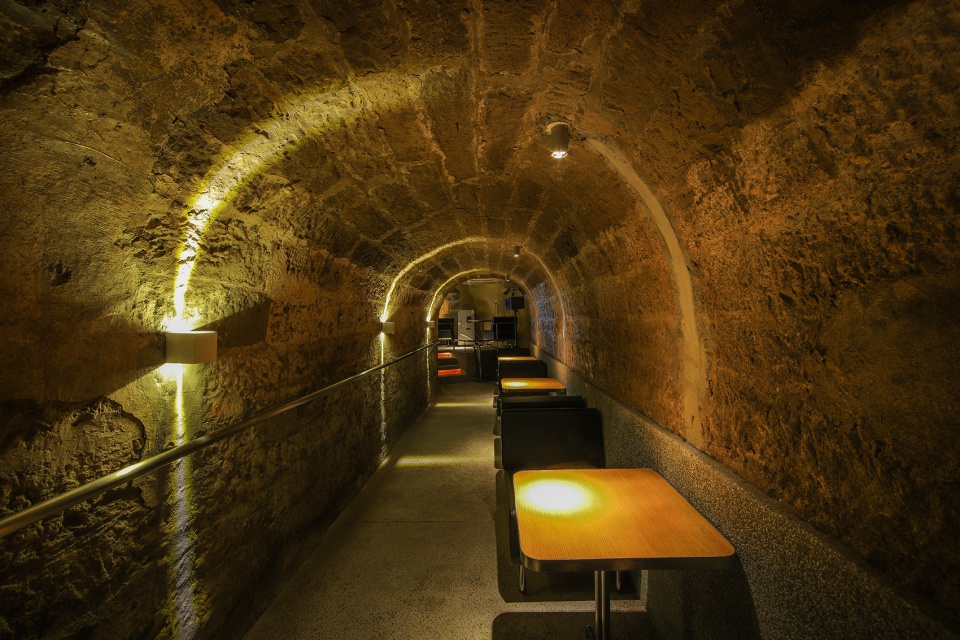
保留防空洞的空间构造,同时也是保留了这个场所给人们带来的记忆和历史价值。
The spatial structure of the air-raid shelter is preserved, this place can keep the memory and historical value that this place brings to people.
▼保留防空洞的空间构造,the spatial structure of the air-raid shelter is preserved©17

材质选择 | Materials choose
地面采用水磨石,墙面完全保留重庆特有的清石板材质以及质感漆的喷涂,为的是呈现最原始的洞穴状态。
Terrazzo flooring and walls are made of Chongqing’s unique stone slabs and painted with textured paint to present the cave in its most original state.
▼材质搭配,material combination©17
空间互动 | Spatial interaction
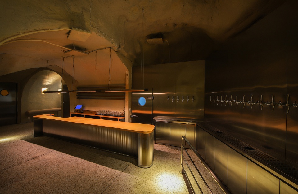
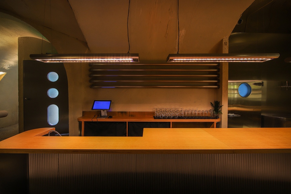
吧台下陷,所有的座位同等高度,方便服务员和顾客交流,营造更加轻松舒适的交流环境。
The bar is sunken and all seats are at the same height to facilitate communication between waiters and customers, creating a more relaxed and comfortable environment for communication.
▼啤酒吧台区域,beer bar area©17
在地生长 | Natural growth
保留并加固原有墙体和地面的材质,在无法破坏墙体的情况下,通过人工增加墙体的厚度形成储酒功能。
The original wall and floor materials are preserved and reinforced, and the wall is artificially increased in thickness to create a wine storage function if the wall cannot be destroyed.
▼壁龛储酒,wine in the recesses©17
光与影 | Light and shadow
防空洞内部空间狭窄,无对外的窗户,长度长达26m, 光线昏暗,在空间上无法给出更多的光线,所以光影成为塑造空间的最主要表达方式。
The space inside the shelter is narrow, with no external windows and a length of 26m, and the light is dim, so it is impossible to give more light to the space, so light and shadow become the main expression of the space.
▼光影效果,light and shadow©17
结语
Conclusion
防空洞就该具有它本来的样子,我们深处在其中,却不知道自然在那里终了,艺术在那里开始。caver 需要做的是寄居于此,体验它,感受它,过滤掉洞外云卷云舒。我们应该创造的是一种精神状态,能给人一场经历,给人一种感动。人们聚集于此,以好奇心开始,以一杯酒结束,时间的代谢,世界的流动,都被拒绝在洞穴之外。
The air-raid shelter is supposed to be what it is, a place where we stay without knowing that is the end of nature and the start of the art. Caver needs to be a place to live, experience and feel. We can create a state of mind that can give people an experience, that can move them. People gather here, starting with curiosity and ending with a glass of wine, the metabolism of time and the flow of the world are rejected outside the cave.
▼细部,detail©17
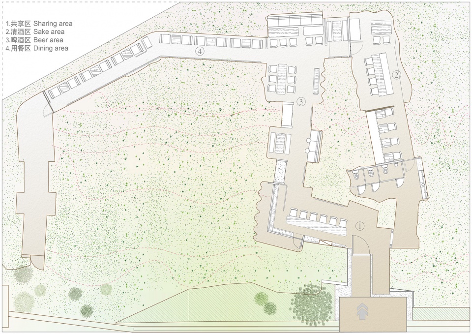
▼平面图,plan©itD studio
项目名称:Caver精酿酒吧
设计方:itD studio/ 罗珮绮
联系邮箱:3410047389@qq.com
项目设计 & 完成年份:2020. 10
主创及设计团队:罗珮绮/苏志展/itD studio
项目地址:重庆市渝中区李子坝正街67号
建筑面积:190㎡
摄影版权:17
灯光设计:袁有无/9024工作室
品牌视觉规划:HOUTH(台湾台北)
平面配置/家具设计:LZ李维纶
客户:HopsCraftBeer啤酒花精酿酒馆

 0
0 19
19



发表评论 取消回复